Wednesday 30 November 2011

Important Nordic Design


A few weeks ago, for the first time I went to see an auction of furniture held near Victoria station. It was an auction for Nordic furniture including world's famous designers such as Arne Jacobsen and Poul Henningsen.

All the furnitures sold on the auction were placed in the space around the auction room.


Use of spaces in between each furniture and lighting was very nice that never bothers each other and also evokes beauty of itself. Simple and beautiful, but also charming Nordic design always fascinates me.

Monday 28 November 2011

Framing Workshop


With Sharon, a woman works at framing workshop, we made our own frames for prints done at Old Street on the other day. Since I was in Japan, I was not familiar to making these frames just for art works. I always bought frames already made for particular sizes. Therefore it was a bit surprising for me that making a frame just for an art work is very common thing here. I've learnt very basic but at same time very important thing that day.

'Making a frame suits to the art work instead of making an art work suits to the frame.'

Wednesday 16 November 2011

Shoes for Beauty


About two weeks ago, I went to see a mini-exhibition of the sculptural art of high heels to The Loading Bay Gallery at Brick Lane.

very architectural high heels

Although it was a free-entry exhibition, it was such a interesting show that gave me an opportunity to see all different kinds of high heels from archaic to nowadays. It realized me that high heels are not just one kind of items for fashion, but also they could be sculptural art. Some of the high heels didn't even have function to walk, they were just high-heel-shaped objects. Looking at all the details of those shoes, I could feel strong passion of each designers. It might seemed strange to some people yet I believe high heels have something that addict people deeply.

Monday 14 November 2011

Parasol Unit

Fifth Night

Last Sunday, I went to Parasol Unit near Angel station. Current exhibition held there was Yang Fudong's short film installations called 'One half of August' presents his three new works.

It was first time for me to see his work. All of his films have no lines but only sound and they were also filmed in black and white. For Fifth Night, I think his way of projecting few synchronized films together is very unique that lets the viewers decide which one to see. And it also lets them more focus on an actor or actress's action and think about what is happening in the film. Actually there was nothing happen in the film even the actors didn't seem to be interested in one another and it had no clear beginning or end. Everything was left to the viewers. I think it was hard to understand what the artist tried to do in this installation at first sight if the description I got at the entrance didn't help me. But I quite like how he use the gallery space to show his work, such as Fifth Night had seven films projected straightly on a long wall or One half of August had eight films projected randomly on walls of a square room.
It was a pity that I couldn't go into the gallery next to Parasol Unit which is closed on every Sunday. Besides that, I enjoyed the gallery space and would like to come back for next exhibition.

Sunday 13 November 2011

What I'm Nuts About

It was such a funny presentation day ever. Everyone in our class had to present thing that they are crazy or passionate about. Some brought  homemade cakes, a funny sheep costume, vintage maps, crisp sandwiches, or her lovely dog. It was embarrassing to do presentation in front of everyone, but after all it was a good opportunity to break out wall and know more about my colleagues.

Things I got home, a joke paper, a paper hat, a necklace made of skateboard, diarect, a cucumber badge, mustache, and a graffiti sign

Lovely classmates all in mustache!

Saturday 12 November 2011

Logo

It started with creating 100 logos. The purpose of this project was creating a new logo that represents our design ethos. My ethos was 'be open minded'. This project was first project that we worked as individuals. 

Be Open Minded

When I was researching on different types of logos, I found that this field is so vast and has various ways of approaching. If there is a next trial for making logos, I would combine images and types together to find out the other possibilities of logos.

Thursday 10 November 2011

Letter Press

As a workshop for GDC student, I went to Old Street to do letter press last week.
We were given quotes from novels and making them to be ready to print was the day's aim. In the studio, the smell of ink and old letter press machine made me feel exciting. It was very stimulating to touch little wood letter pieces and place them into a flame tightly. I had a knowledge of how to do letter press before but it was different when I actually did it. Thinking about composition of the letters and filling spaces with tiny steel blocks was extremely hard.

my final print

It took a whole day to finish my line even if it was that simple. Above all, I really enjoyed playing with different types and making my hands dirty. Also it was a good way of understanding layout of letters in analogue way. I wish I could come to the studio again to do some work for my course.

Saturday 5 November 2011

Camden Art Centre

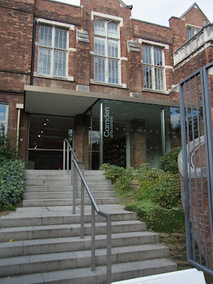
Last Saturday, I went to Camden Art Centre in Finchley Road for the first time. An exhibition called 'A World of Glass' by swedish artist Nathalie Djurberg was held at the time.


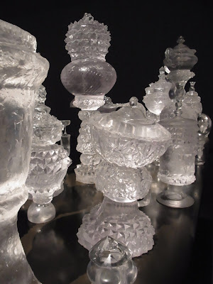
The show space was filled with glass like objects and four claymation films were played in two rooms. The glass like objects were so beautiful under lighting in the dark rooms.  By contrast, the claymation films seemed eerie even if there were animal shaped characters in the film. I think it was because of the films' subjects, maybe sexuality, violence, and brutality, and the sound composed by artist's collaborator Hans Berg, which evoke strange atmosphere in the whole space. It was an unusual moment as if I was lost in unknown world.

Tuesday 1 November 2011

Chelsea Map Project

Huge map of area around Chelsea College:)


It was one of the projects for the students to breaking ice and get to know each other. In groups, we researched area around college and made a giant paper-made map at Banqueting Hall in one day. 

Saturday 22 October 2011

Real Venice, Museum of Everything

Last Sunday, I saw some exhibitions at centre of London.

First one was Real Venice, photography exhibition held at Somerset House.


I have been to Venice once. Some of the photos at the exhibition remind me of the beautiful city, but some of them showed me different aspects of it such as ordinal people living there or modern offices. I personally like the photos by Japanese photographer Hiroshi Watanabe used as a main image for the exhibition. His black and white photos of people wearing traditional carnival masks were striking to represent Venice yet very elegance and even have divine beauty compared to commercial photos. The carnival mask of Venice is known for its vivid colour and decoration, but by reducing them, I think the photo succeeded in discovering its own beauty in simplest form.


The next one was a contemporary show of The Museum of Everything at Selfridge.

The Museum of Everything is a museum for works done by people who suffer a variety of psychological, neurological, or physical problems from all over the world. 
At first I found it really interesting that how they built the show space. The space was parted into several small rooms and the works were fully hanged on every wall exactly like the museum itself.  To be honest, it might make audience hard to see each work, but also make them feel like if they are in the museum at the moment. Each work was very energetic and had a strong character reflecting each artist. Some of them had remarkable colouring and some were seriously detailed by persevering which I can hardly imitate.


For the last, there was a huge structure, the Monument to the Third International, designed by Russian and Soviet architect Tatlin Vladimir in front of Royal Academy of Art for upcoming exhibition. Although this tower is not as high as his original plan, which was as tall as Eiffel tower in Paris, it has a worth-seeing strong impact just being there.

Saturday 15 October 2011

Moments in Time

Today I went to see Dominic Wilcox's watch sculptures at Dezeen Space in Shoreditch.


It was really hard to find the place and the showspace was quite small, yet the watches were worth seeing.

Hide 'n' Seek
“A pig tailed girl hides behind a tree from a searching boy.”

Adventures of a young vegetarian
“A small girl attempts to stop a butcher chopping up a pig by hanging on his arm while the pig floats away.”

Sitting Man

Watch Sweeper
“The numbers and hands of a watch are swept away by a watch sweeper.”

The unrequited handshake
The outstretched hand of friendship is continually rejected.”

The idea to put people on each minute hand and second hand was absolutely wonderful. As the vintage watches are working, the people on each hands keep moving, sometime coming closer and sometime farther. Wilcox's work reminds me this proper thing that "time is continuous moments". In the glass domes above watches, there are different worlds of people inside and they are living in their own moments of time. I love the artist because he always uses everyday objects but represents them in unexpected way.  I also like his charming sense of naming each watches. Wilcox's magic to change watches into tiny worlds was really enjoyable!! 

Well, because I'm a big fan of Dominic Wilcox, I asked for price of the watch(it wasn't shown in the space), and it was.......more than £600!!!! I shed tears on the way home....... (joking!)


Descriptions of watches were from:
Moments in Time: Watch Sculptures by Dominic Wilcox
http://www.dominicwilcox.com/watchsculptures.htm

Dezeen Space
54 Rivington Street, London EC2A 3QN
www.dezeenspace.com

Sunday 9 October 2011

Failure

A week past since I started my new course at Chelsea College. In the end of the first week, there was a project which my group failed to do it. We were given a huge sheet of plain white paper and had to make people interact with it.

We started the project with brain storming about what can we do with the sheet of paper. We got several ideas we like such as free hi-five, free candy, finger printing, huge picture flame, information paper.... Finally we end up with making a poster which attracts people to see it. However we all believed that our poster could be interactive for people, we completely failed.

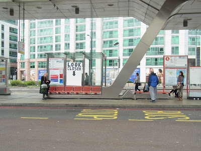
It says "LOOK CLOSER" and there is a tiny message below the arrow.

The basic idea of our poster is that if there is something you can't see from a distance, people would come closer to see what is there. So we went to Vauxhall station where should be a lot of people there and especially at bus station, people standing and waiting for bus coming. In fact, there was no one who comes closer to the poster to see the secret message.
I think there are several reasons why our poster defeat our expectation. One is the location. Since other groups went to more tourist places such as Westminster Abbey, Trafalgar square, or Oxford circus where there are hundreds of tourists there. Compared to these places, Vauxhall station was not a place to find friendly people who will be curious about our project. Secondly, we had to work on people to focus on the poster, not just waiting from a faraway. Thirdly, I think we had to keep our idea much more simple rather than making a 'designer-like' piece. For example, the other group did 'free-moustache' at Trafalgar square and it was really successful. It was like an information paper that people can take a contact address in the bottom, but hand-drawn moustaches instead of contact address. People like free things especially if it makes people happy and if it is easy to take. The idea of free-moustache definitely enjoyable for people and the location was also perfect for that. If we have done free-candy poster, sticking candies on paper and people can take them, it would attract many people even if we done it at Vauxhall station because it is so simple and people like candies.
I think this project was a good try for me that I could learn many things from it.

Saturday 8 October 2011

Serpentine Gallery Pavilion

   On 29th of September, I went to Kensington Garden to see this year's Serpentine Gallery pavilion designed by Swiss architect Peter Zumthor.

It seemed like just a black box from outside.

There was a long corridor all around the building.
When you walk pass the dark corridor....

There was open sky garden inside with lots of sunshine!!

   I really like the contrast of the outside and inside. I think it was very effective that the architect hid the   garden secretly inside the black box. It made the viewers curious about what is inside and increased the beauty of the garden more when they found it.


The garden was a bit too wild compared to general English garden, but I think it goes well with the surrounded building. The building looks like very artificial because of its shape, rectangle, and its colour, black. But when you look closely, it is covered by organic net. I think this wild garden and organic surface related to each other to make the space more comfortable to feel the nature for the viewers.

   The building has no window or modern technique, but it was still a place for people to relax and have a rest. I really enjoyed reading a book and having tea while sitting beside the secret garden.