Tuesday, 14 December 2010

Shadow Catcher

On the same day I went to Bookart bookshop, I also went to V&A museum to see Shadow Catcher.
I heard about this exhibition from my photographer friend, and it was his recommended.
It was a exhibition about photograph not using a camera.


by Floris Neususs
using photogram of shadow and light

by Adam Fuss
using photogram of symbolic motifs

by Susan Derges
using photogram of water(such as river) outside at night
She graduated Chelsea College!

Nowadays, everybody can take good photos because of the progress of technology.
But by this exhibition, I realize the importance of going back to the basics and see things differently.

Monday, 13 December 2010

Bookart Bookshop

On the weekend, I went to Bookart Bookshop for the second time.

Bookartbookshop
17 Pitfield St, London, N1 6HB

In the shop, I found my favourite.
The author of the book is Paul Johnson.

It was a popping up book.


His book reminds me of Robert Sabuda.
"Alice in Wonderland"
I have collected more than 10 series of his books including this one!!
I love his creative ideas!


Actually I wanted Paul Johnson's book(the red one I put the photos up), and I asked for the price.
Guess how much it was............


It was £150!!!!!!!!


So I gave up to buy the book, but I bought a different one of his.

"Garden of the Mind"

Tiny popping up book!!!!
It is about 5cm tall and not as expensive as the red one.
I was so happy to have his book.

There were more interesting books in the shop and I've learnt some ideas from each of them.
I think it was a great research for my next project, 'three extraordinary books.'

Sunday, 12 December 2010

I see what you mean [PART2]

Part 2 of the previous project!
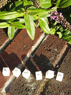
Using the same phrase again, but on this stage I had to put it within an environment.


These are my finals, but I still have to develop them...


Saturday, 11 December 2010

My Neighbor TOTORO


After I put the last movie, it reminds me of this Japanese film.
My favourite movie from my childhood!!

Monsters.Inc Opening Credits


So cuuuuuuute!

007 Casino Royale Opening


Amazing use of playing card motifs!!

Ocean's Eleven


I like this musical-like opening!

Western Spaghetti by PES


YUM YUM!!!

Ilana Yahan -Sand Fantasy-


Sand magic!!

Kashiwa Sato

He is my most respectable designer!!!
Kashiwa Sato is one of the most famous art directer in Japan.

He is the one who designed logo of UNIQLO.


He does many advertising posters in various ways.


He designs products too.

His designed mobile phone
 
Typography used for this phone is his design as well.

And.....he designed an infant school!!

The building is oval shaped and kids can play on its roof!!


I love him because his design is very simple and straight that has strong impact.
He always has lots of conversation with his client until he understands them and knows what they really want.
So he makes an accurate work all the time.


 His official website

Visit his COOL website now!!
http://kashiwasato.com/

Friday, 10 December 2010

I see what you mean

The next project I got was TYPOGRAPHY.

It started with handdrawing a poem in 50 different ways using ordinary typefaces.
Then the goal for this project was to express the sense of the poem through the placement and the scale of the type.

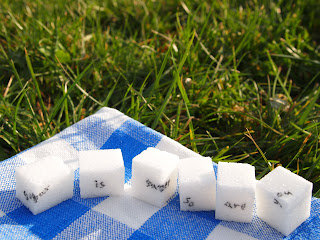
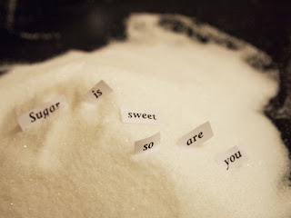
The poem I selected was "sugar is sweet, so are you" by Mother Goose.


Actually, I did more than 50...


Finally I chose these 2 pieces.

                                                                                         It's more black & white...
I chose them because I liked their simplicity and clearness that you can see image of sugar.

It was such an exciting project for me and I realize that I have strong interest in types.

Wednesday, 8 December 2010

List List List!!

This was the next project I got in Vis Com.
From several subjects of what the list is about, I chose '10 Places to Hide' and '10 things that should not exist(but do)' to work on.

Through researches and some experiments, this one became my final piece.

I'm hiding behind the 10 letters.

They are popping up letters and you can see me hiding only when you turn the light on.
I got this idea from my drawing in my sketchbook and my previous project from Vis Com.
I did some different versions as well, but I thought this one works the best.


Also I did one more final piece which was a list of 10 things that shouldn't exist.
In this case, my list was about some kinds of insects.

Some of you know, this looks like an eye chart.
In the use of the eye chart, as it went down, it became hard to recognise the bottom if you have bad eyes. So I tried to make a link between the feature of the eye chart and my wish for the insects.

Tuesday, 7 December 2010

3D to Vis Com

After the first project finished in 3D, I changed my area into Visual Communication. The reason for this big decision was because I felt it is more interesting in Vis Com than 3D. During the reading week, I got both projects from 3D and Vis Com and did them.
The first project for Vis Com was called '30 Things to Do.' As it is shown in the title, it was a project doing 30 different things such as "write your name in water," "draw every chair you sit on today," "Before/After," and so on. I really enjoyed doing this project because it was so much fun to think about the ideas for each things listed in the brief.

    'Write your name in water'

    'Dress as someone else' (It's me!)
    'Go into public space and leave a message'
    'Carrots make your hair curl'


Actually, I couldn't do the second part of this project which I had to develop one of the work I did into a finished piece that I can put straight into my portfolio. But I would do it when I got enough time(maybe during tutorial week...).

Monday, 6 December 2010

Last 3D

After the assessment, I got into 3D to try myself if I could go on in this area.

First project was called "Reuse -Remake -Reinvent".
It was the project that I transform used furniture into a different furniture.


This is my final piece, "fruit basket".

There are top part and bottom part. 


It was a dishrack at the first.
The second one from right


From the photos, I came up with an idea of Gaudi's architecture I saw in previous week.
So I started to make a structure that has a natural form.


Finally, I think could make what I wanted. 
It suits in stylish living room!


However this project works well, it became my last project in 3D.
I changed my area into Vis Com after that......